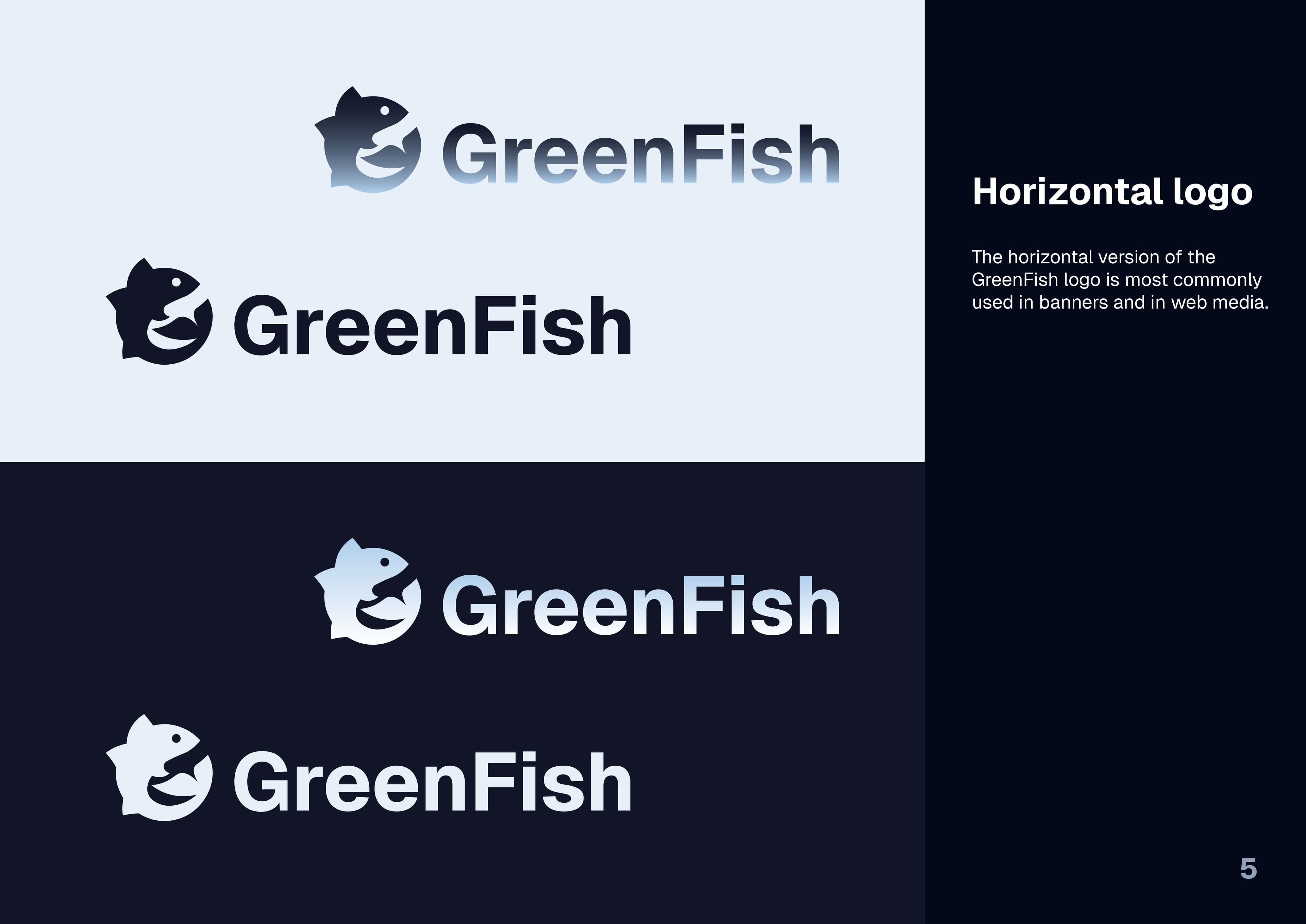
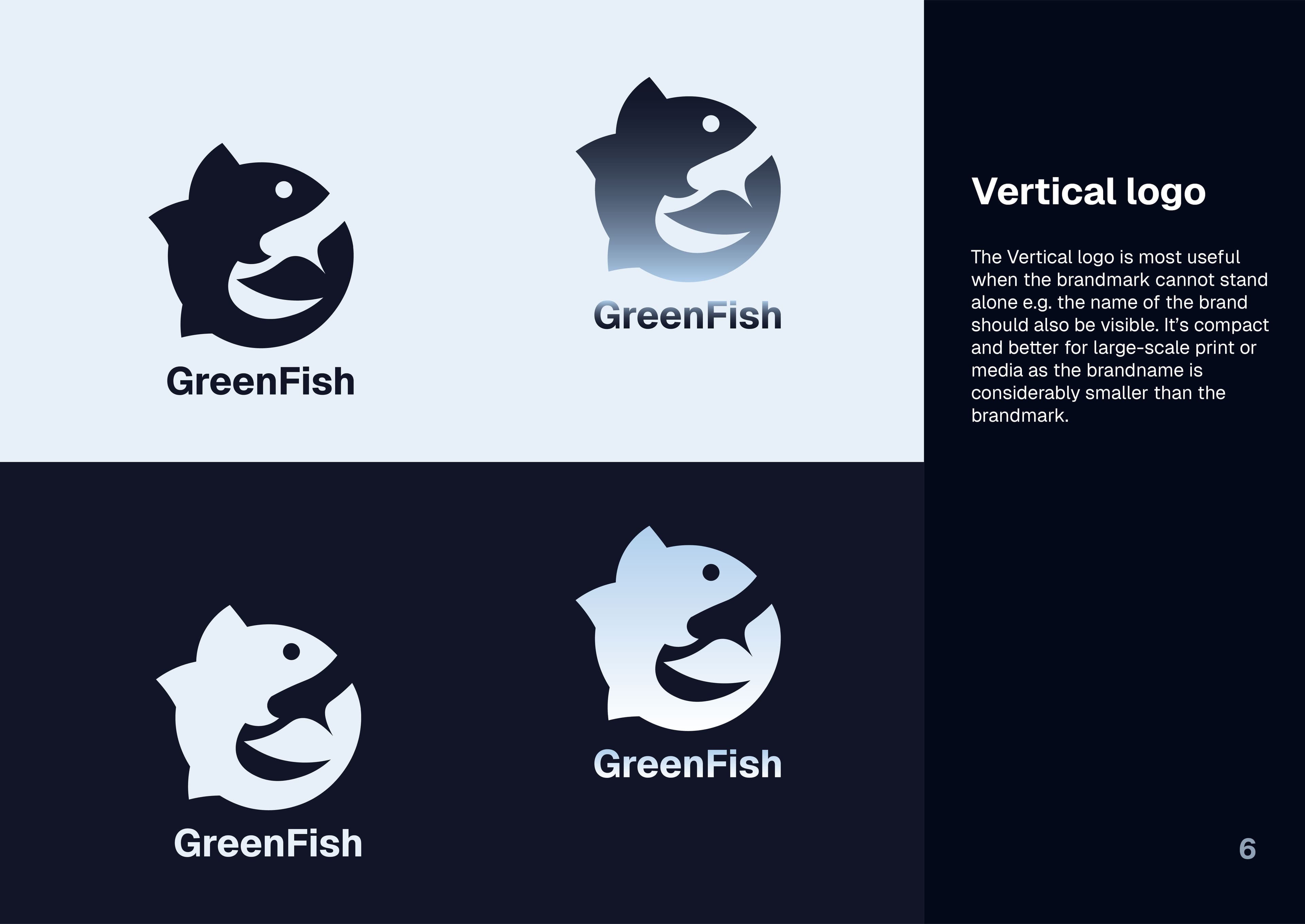
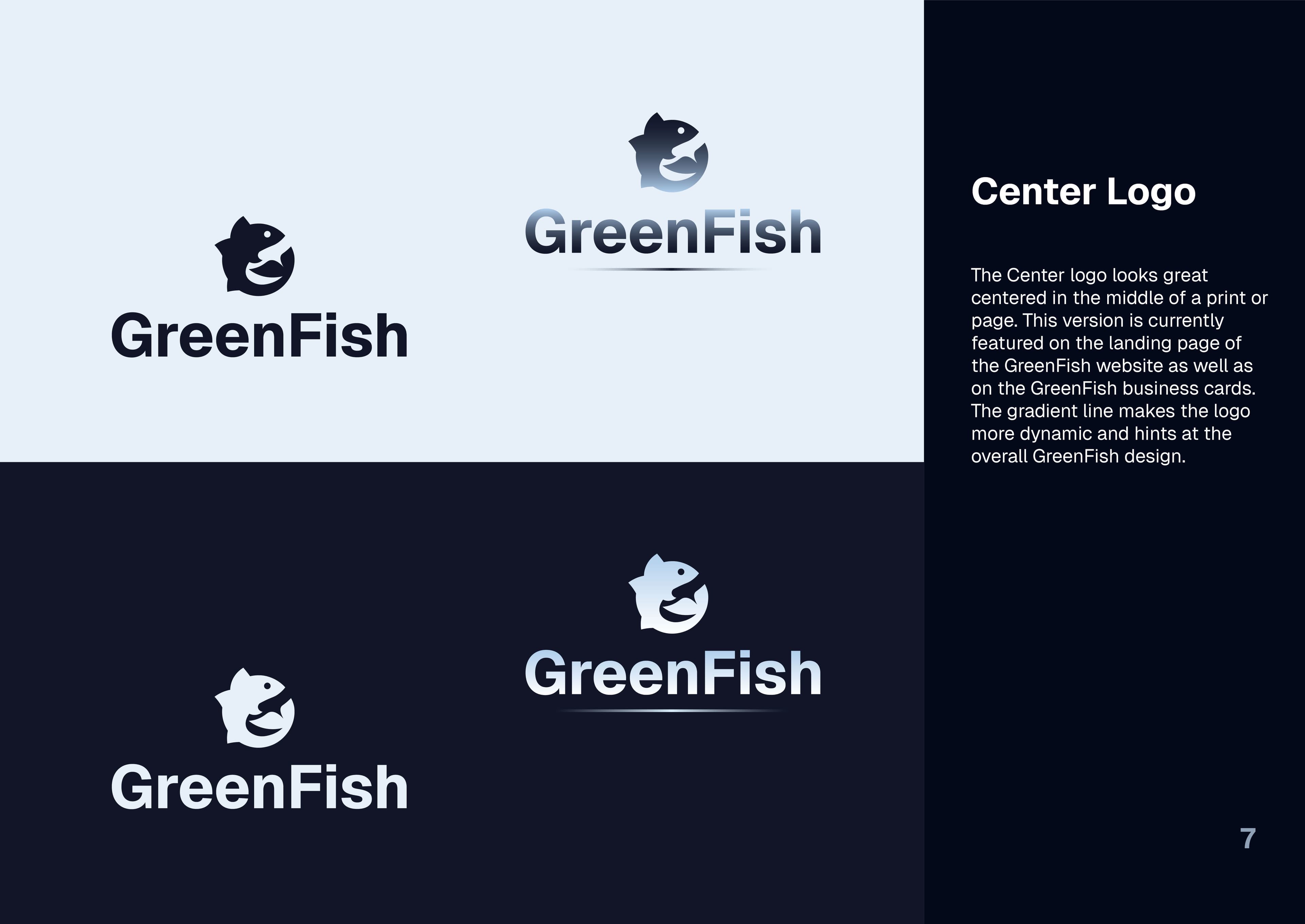
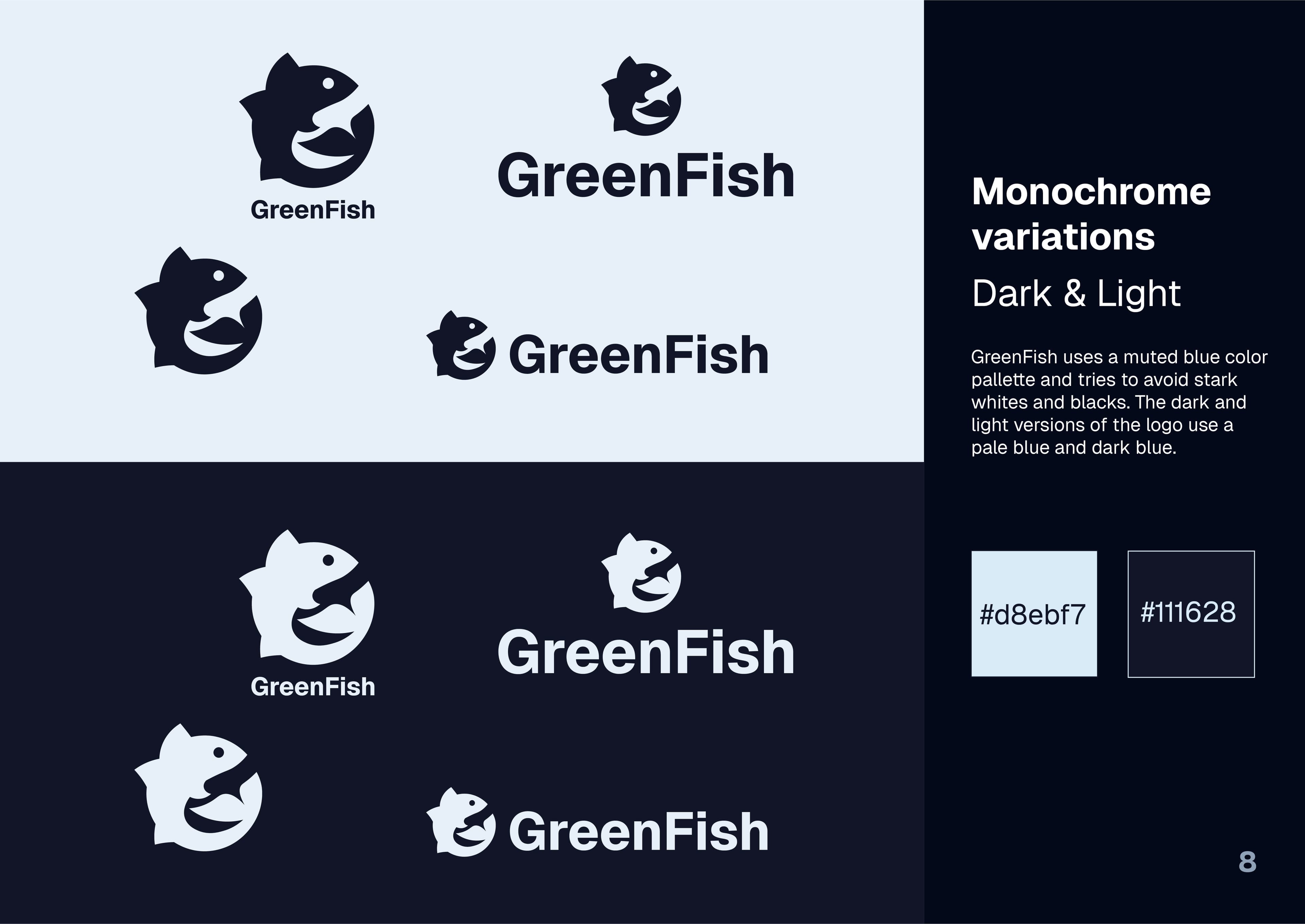
GreenFish - Branding & Identity
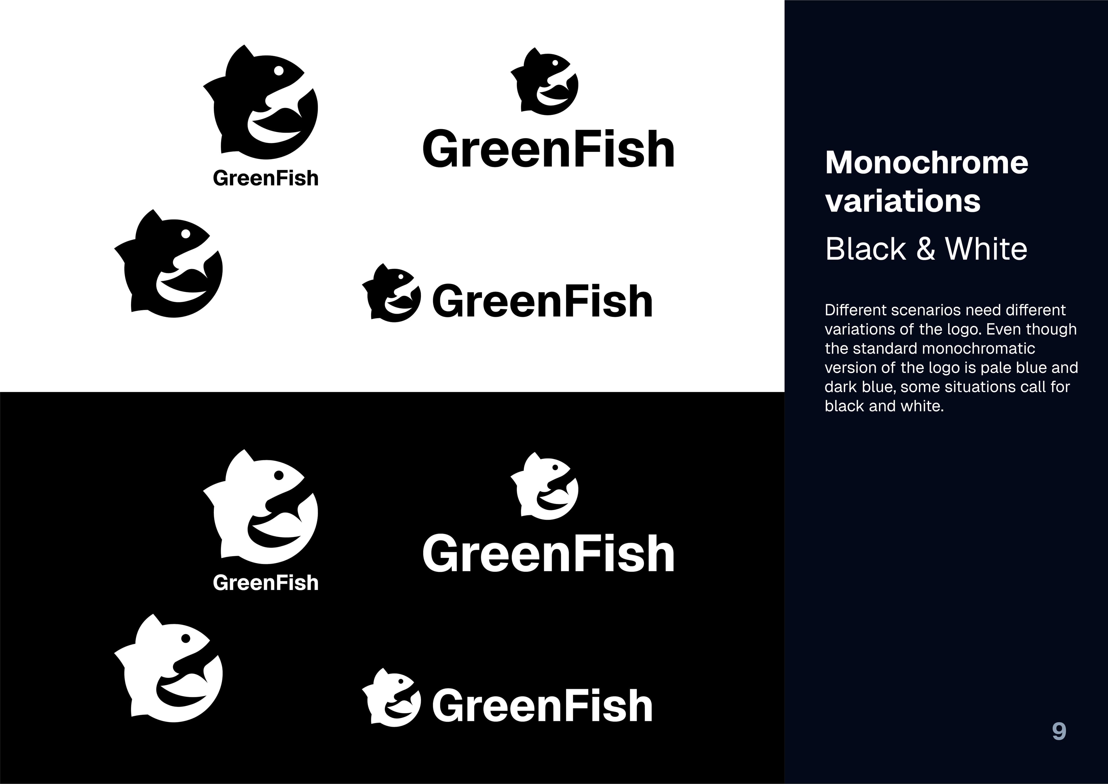
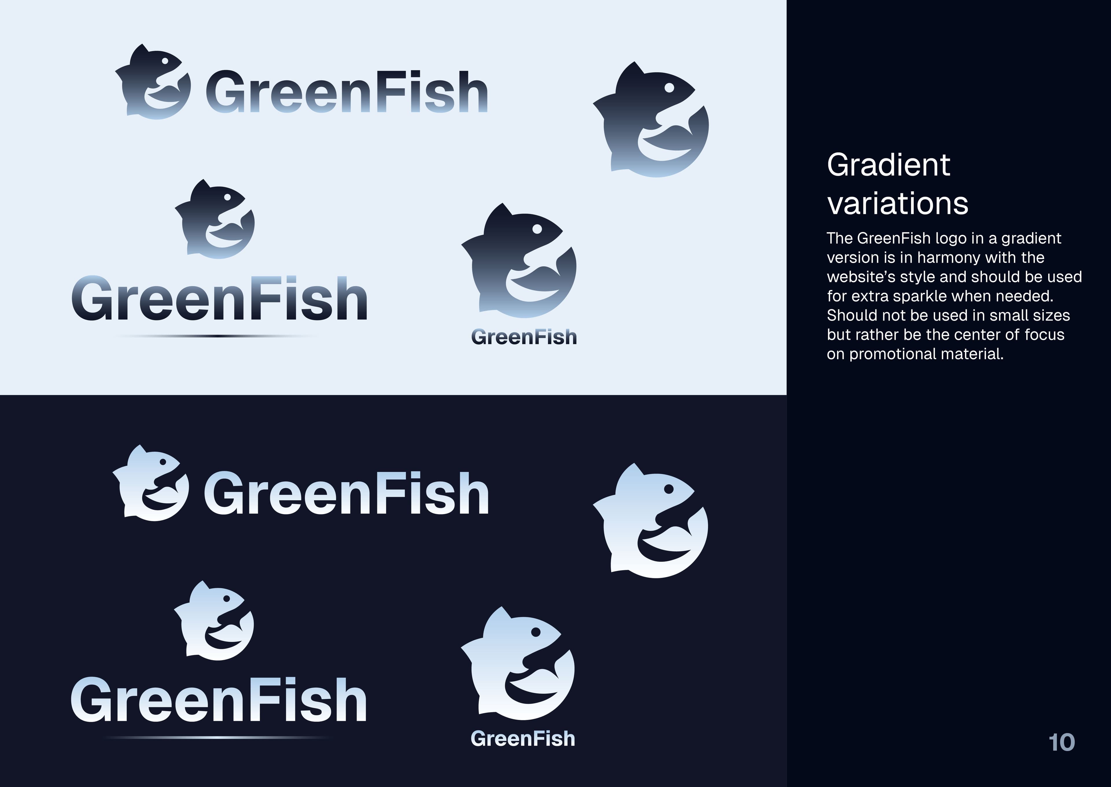
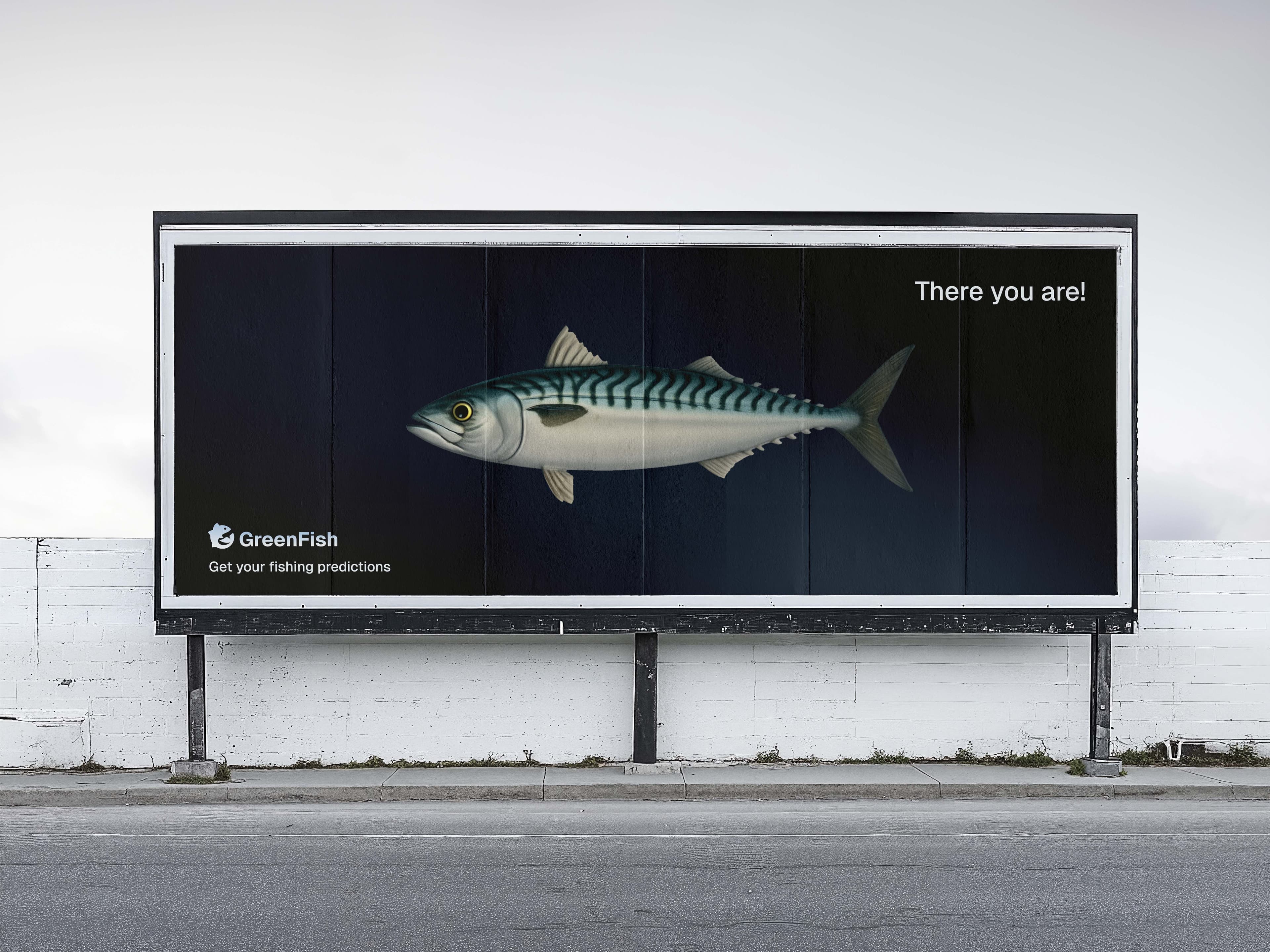
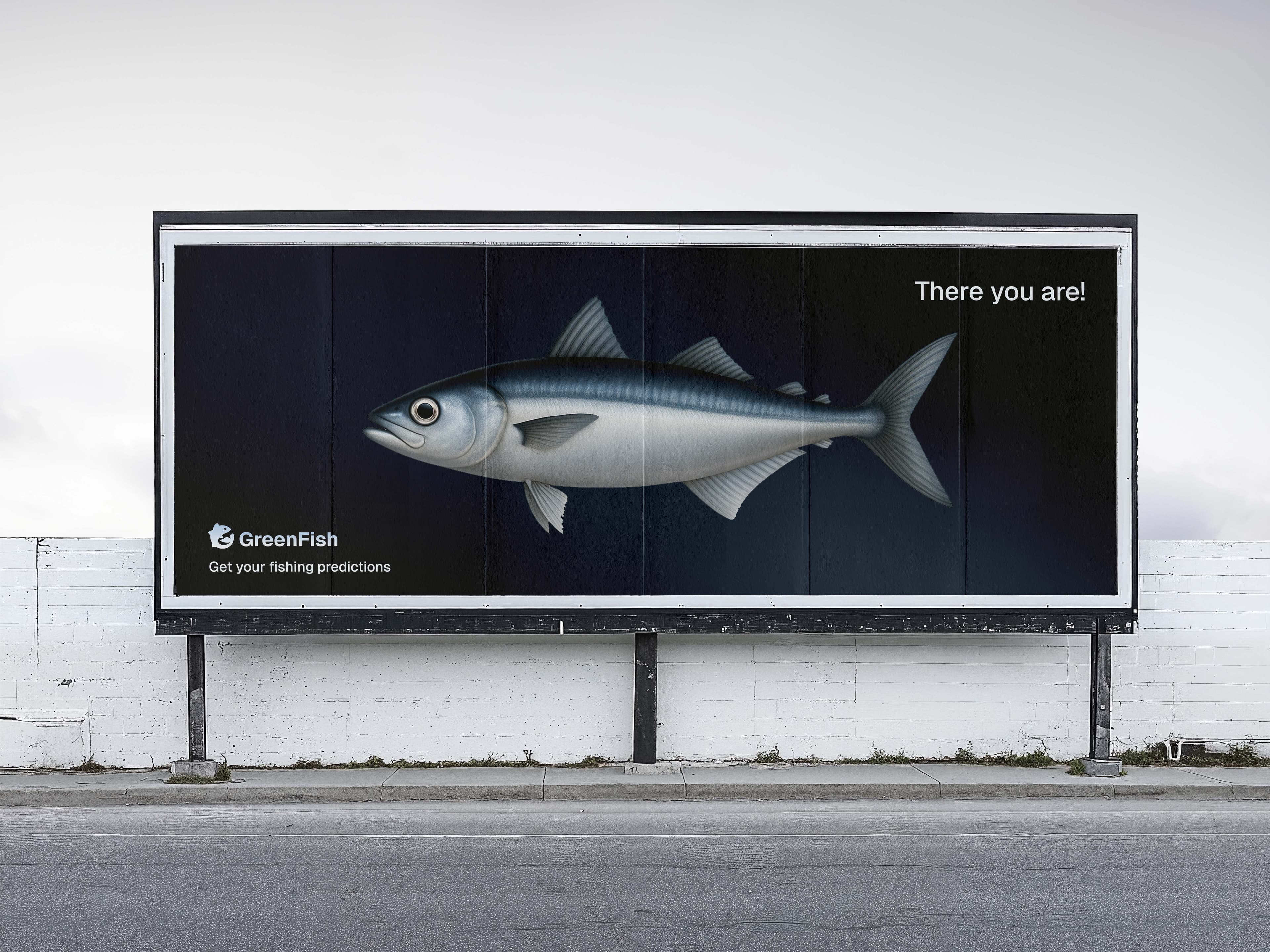
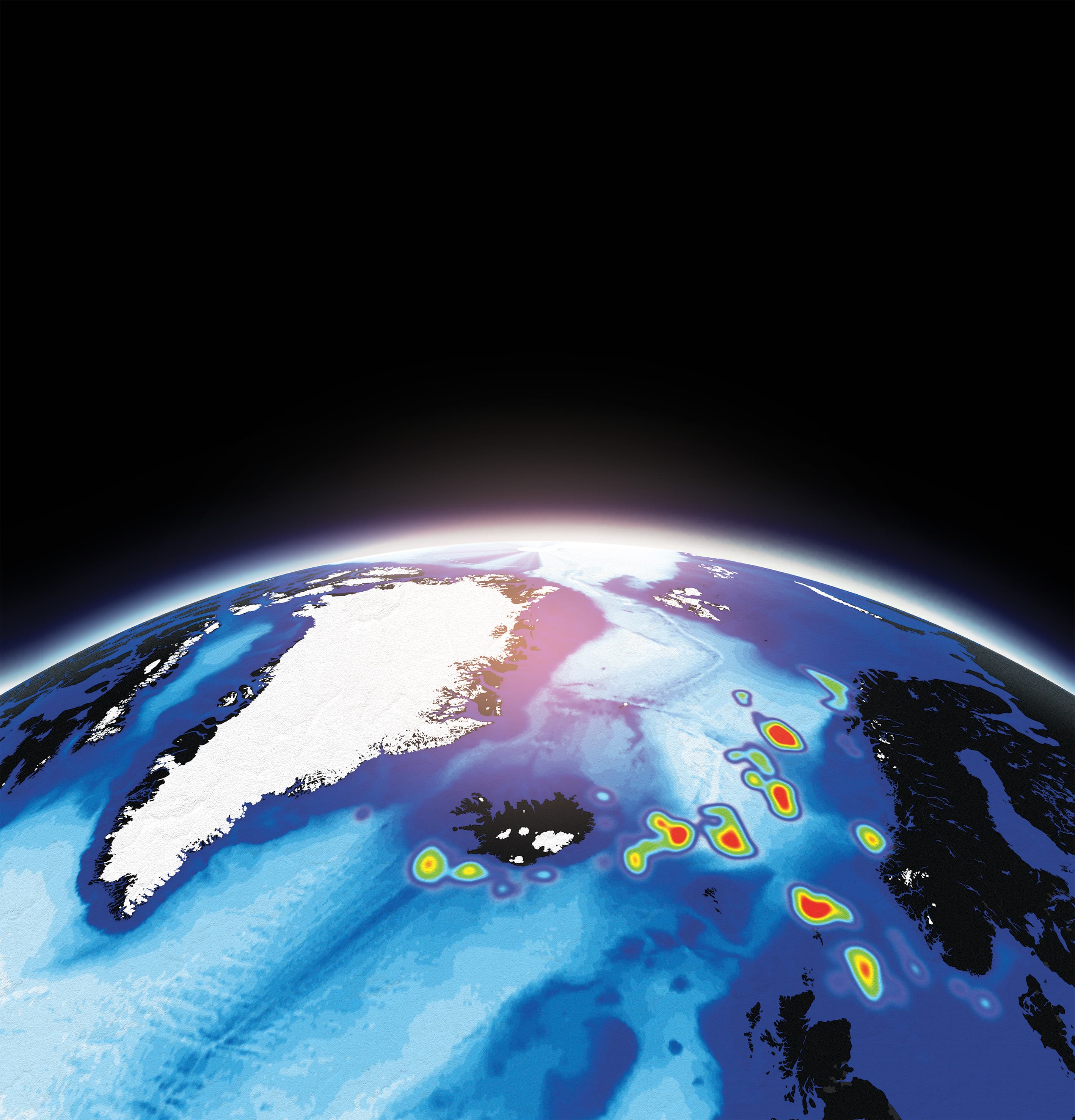
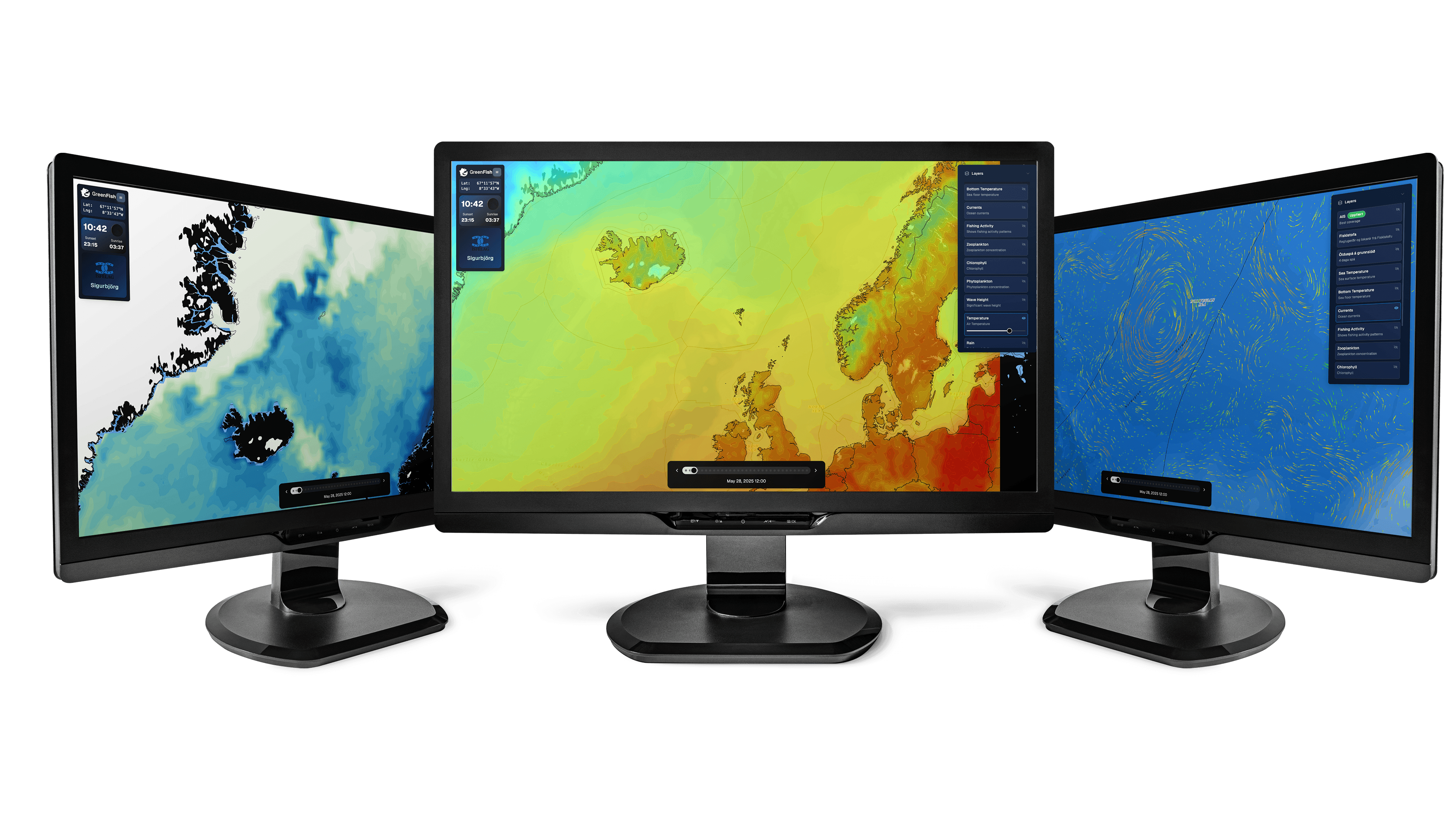
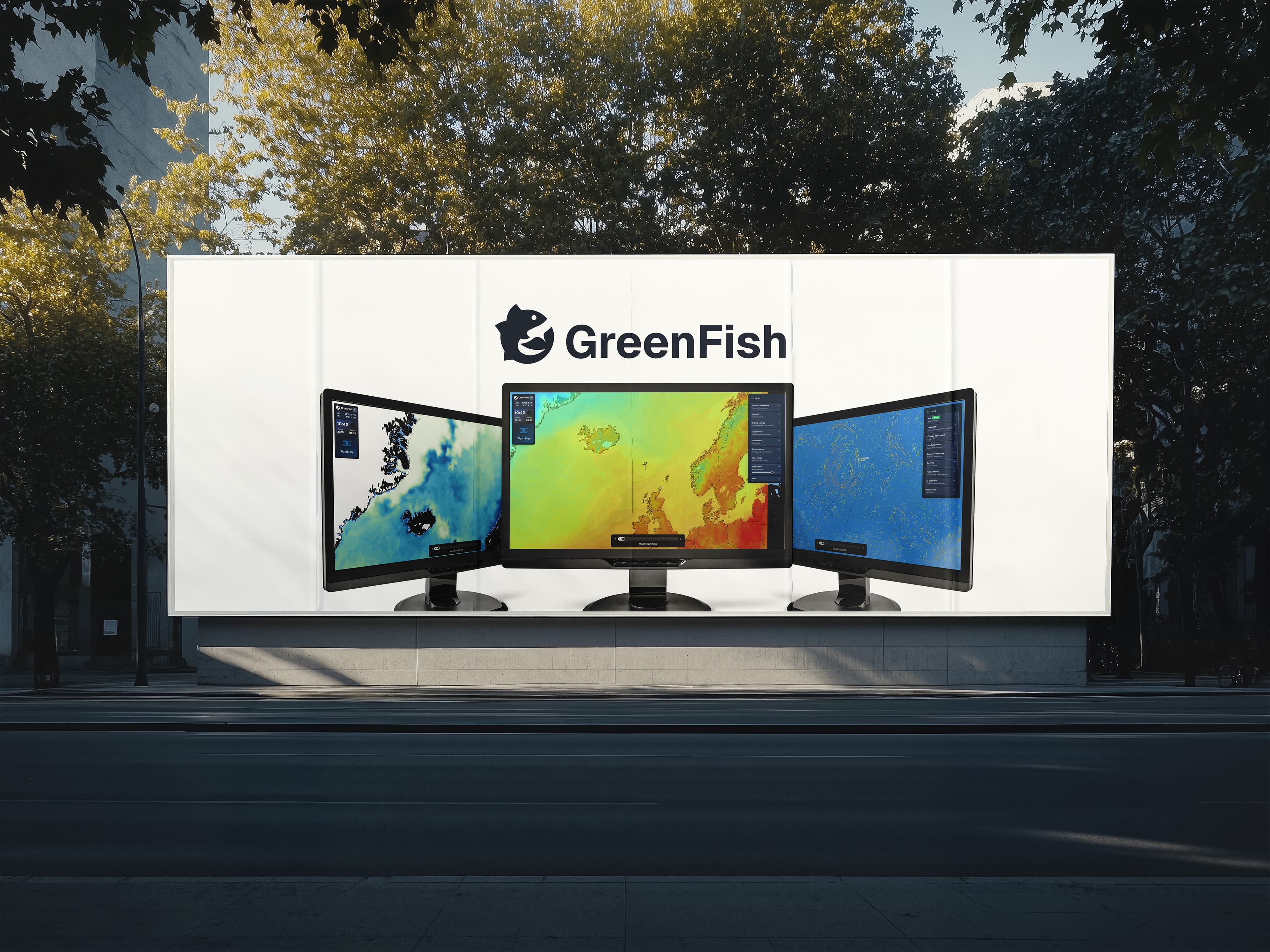
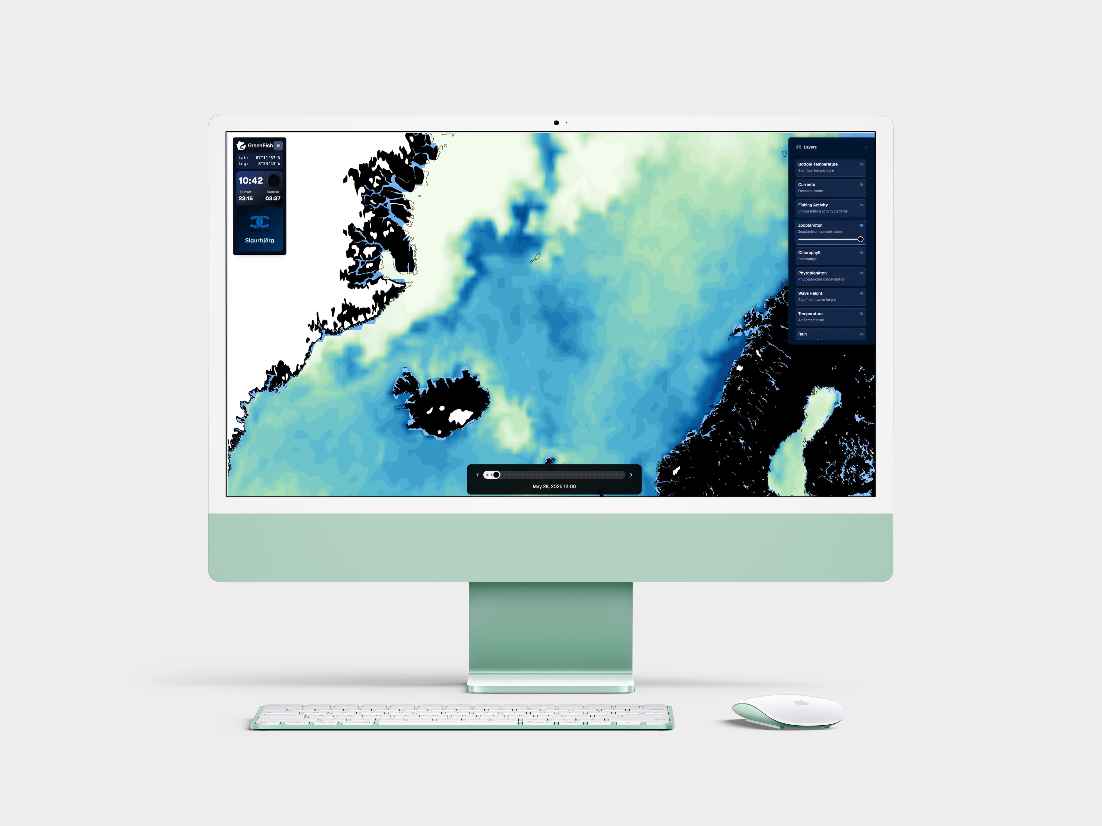
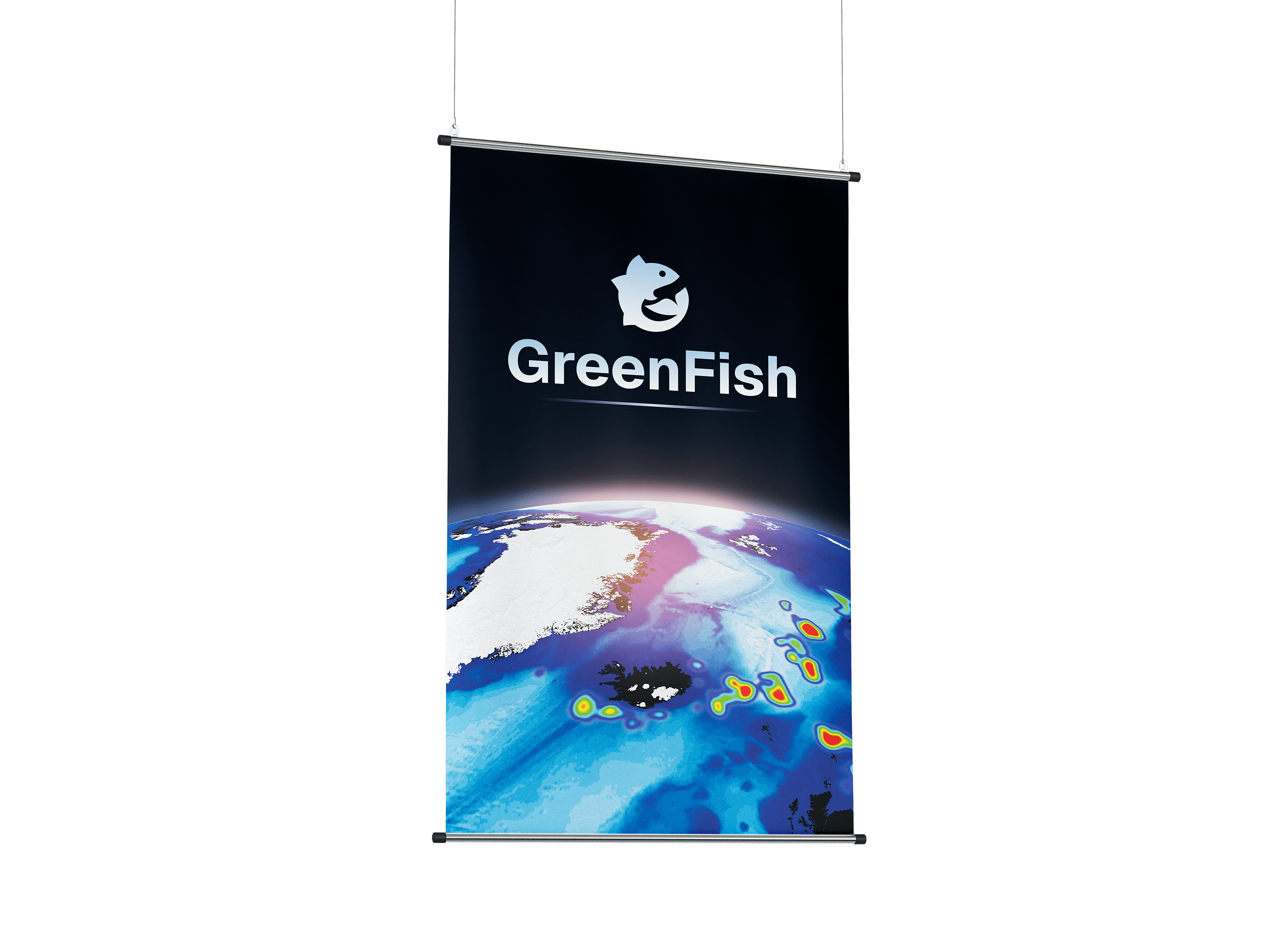
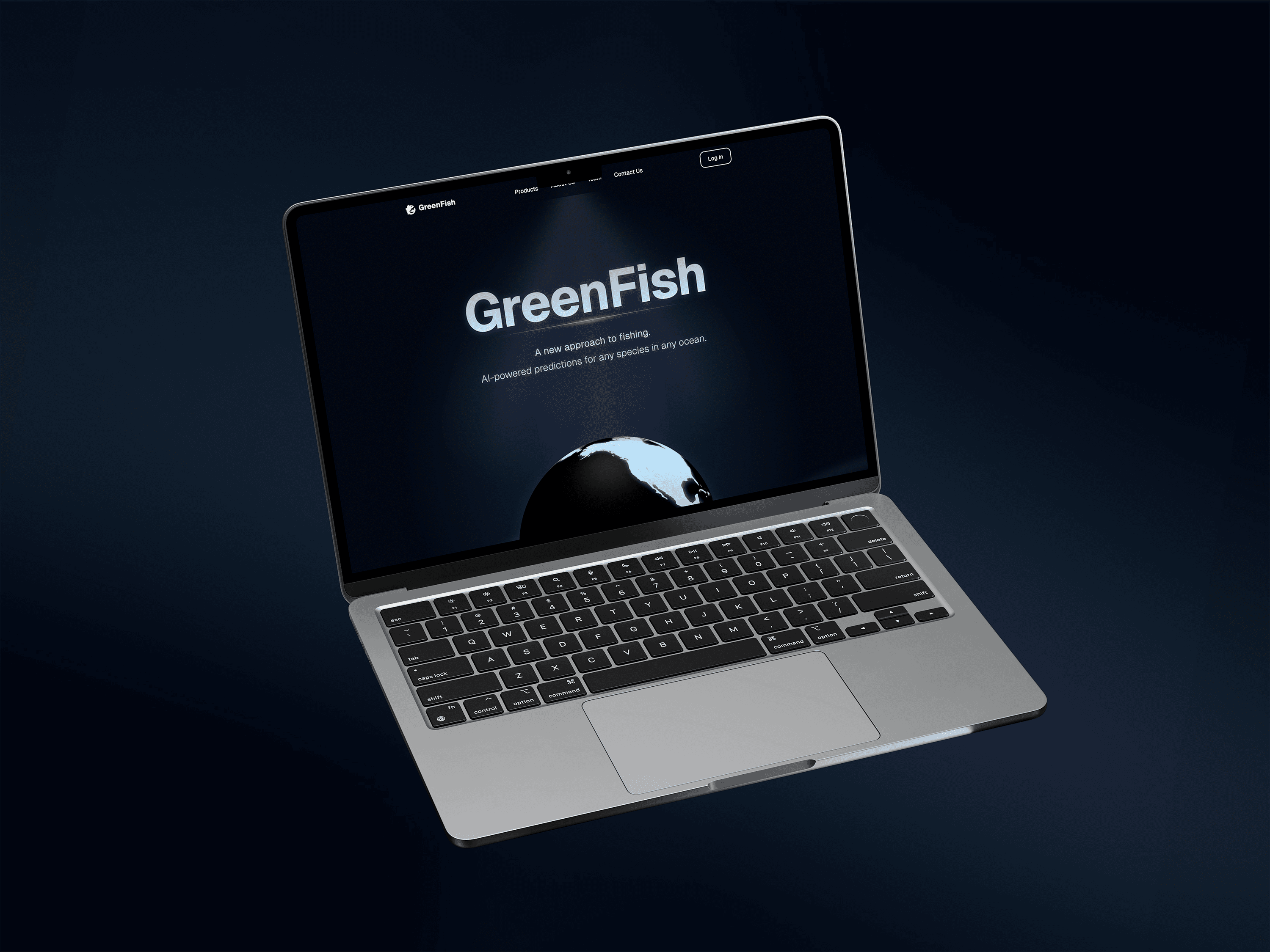
Designed the company logo and overall brand identity for this startup. Designed and produced graphic assets for web and print media.
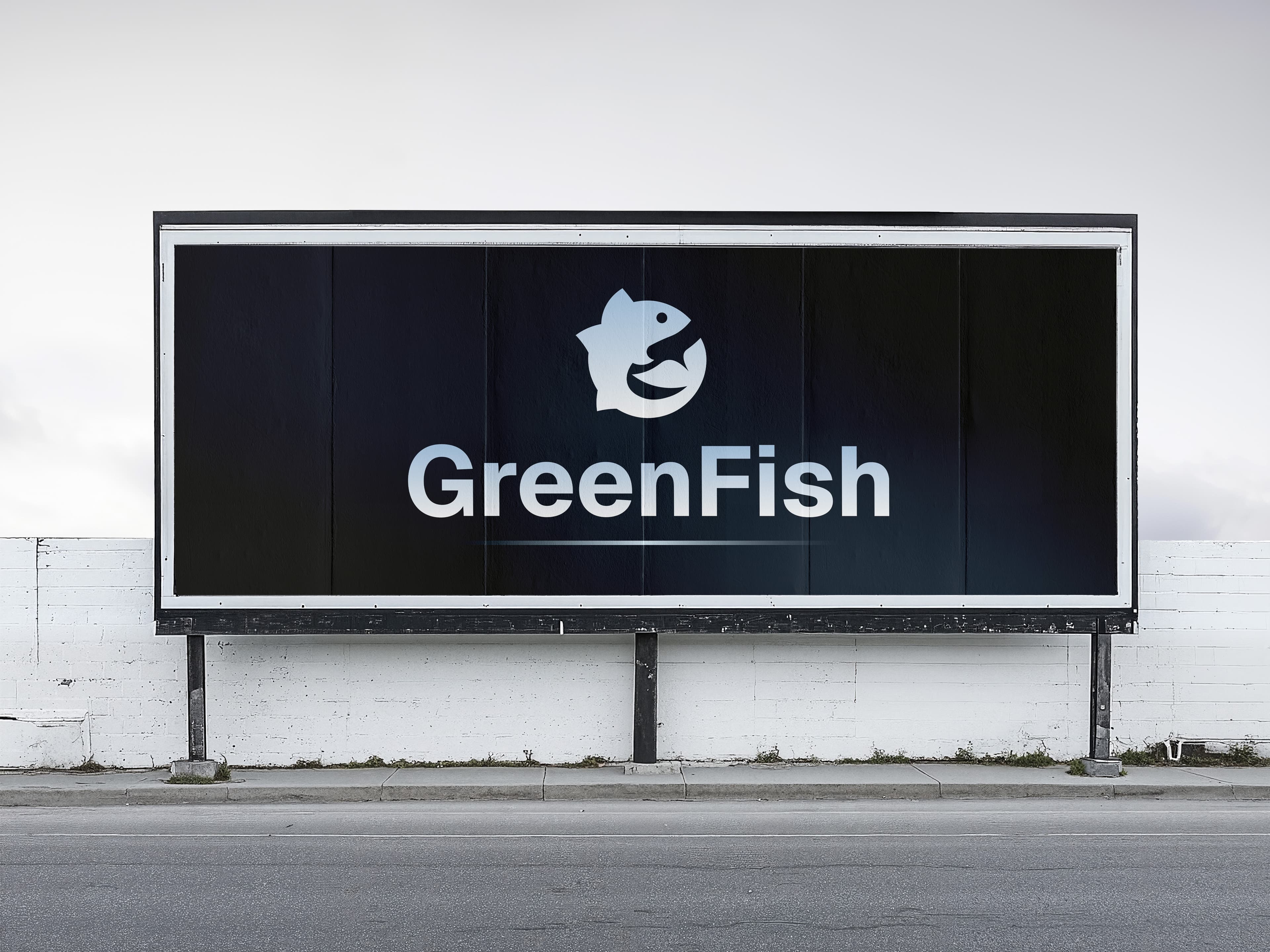
Designed the company logo and overall brand identity for this startup. Designed and produced graphic assets for web and print media.